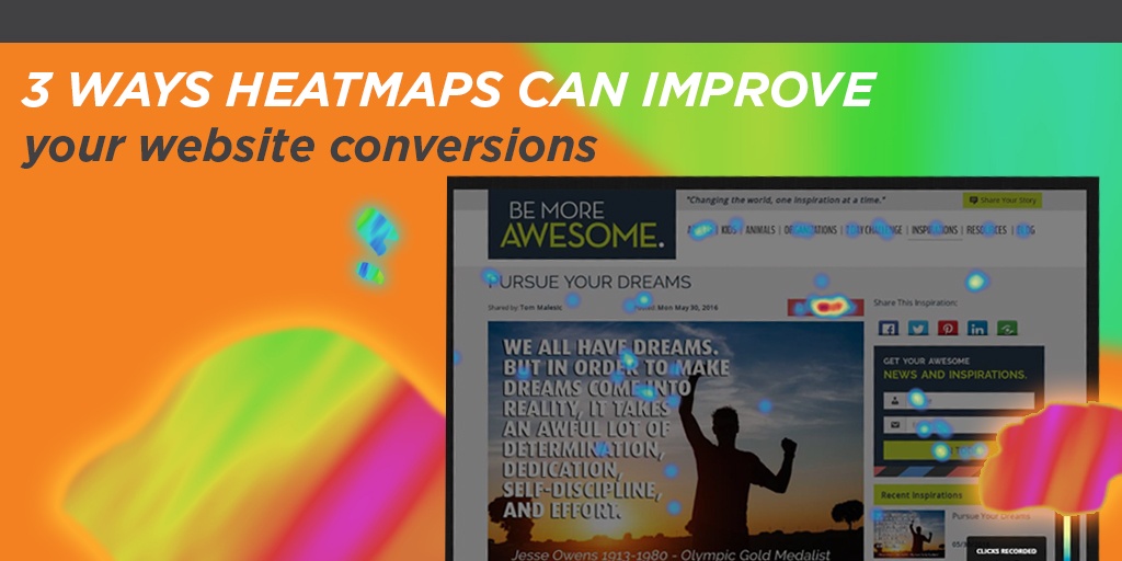
Heat maps are data visualization tools used to show you where website visitors are looking and clicking on your website. Heat maps use graphics to reveal complex data points in a simple, streamlined way. Using a warm-to-cool color spectrum on your desired page, it shows you which areas of the webpage are receiving the most attention.
These tools are so useful because they offer valuable insight into the performance of your website; once you understand where people are looking on the page, you can make better decisions about how to improve your website. Understanding how heat maps work and the value they bring to your site can help you make major, revenue-generating adjustments. Here’s what you need to know:
What You Can Learn From a Heat Maps
There are plenty of things you can learn from a heat map, such as which headlines are most attention-grabbing, what images are most appealing, what distractions are keeping your customers from engaging with core content, whether your navigation is effective, and much more. For example, let’s say you’ve recently added an on-site search button. Are people noticing it? Is the search function useful, and are people looking at their search results carefully? If not, you might want to invest in a smarter search tool with better features (like this autocomplete feature on Instant Search Plus: https://www.instantsearchplus.com/instantsearchplus-autocomplete-magento/).
When to Use a Heat Map
Your business or brand can benefit from using a heat map at any time, although some use cases are better than others. For example, if you’re planning a website redesign, now might be a great time to see whether your redesign efforts make a difference. Use a heat map on your current site to learn more about different areas of improvement, and utilize these answers as you build out your new site.
Split testing and A/B testing are great use cases for heat maps, too. Split testing is the process of comparing two variations of something that are completely different from one another, while A/B testing is the process of comparing two variations of something similar, where only slight modifications are made. This level of testing is so important because it shows you what your users are most likely to respond to. Do certain colors or typography work better than others? Is one design more appealing than the other? These are all questions that split testing and A/B testing can answer, and when you test using heat maps, your strategy can become that much more powerful.
Content Engagement
Heat maps are highly effective tools for analyzing content engagement. As you may already know, content is king and is a vital part of any marketing and search engine optimization strategy. Search engines used content to identify clues about the relevance of a page. And as a business owner, when you’re putting time and money into your content, you want to know how it’s actually performing. While page views and time on page statistics do offer some insight, they aren’t always as revealing as heat maps might be.
For example, if you spent several weeks putting together a long-form blog post, you might use a heat map to see which areas of the blog post users lingered on longer, and whether readers were reading to the end of the post altogether. If you learn that no one is reading to the end, or that people are skimming past certain sections, you’ll be able to better understand which specific parts of your content are most appealing—and then you can capitalize on that.
Heat Map Case Studies
Heat map case studies reveal just how value-inducing these tools can be. By reading clear examples of how other brands made successful changes by using heat maps, you’ll gain a better understanding of the benefits of heat maps.
For example, Softmedia, a penny auction software provider, used heat maps to identify distracting areas on their website. They discovered that certain elements—including a “Do Not Click Here” button—were distracting people from selecting the “Request a Quote” button. A video demo on the “Contact Us” page also distracted visitors from actually filling out the contact form. Once these simple distractions were eliminated, conversions improved by 51%.