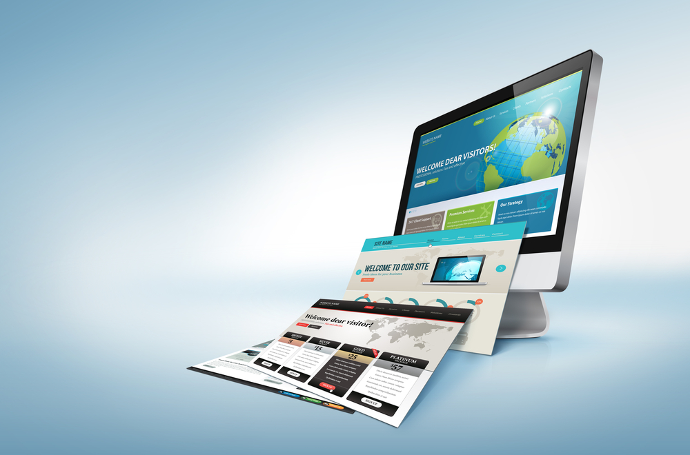
With the advent and incorporation of technology in the life of the public, the significance of responsive designs has greatly increased with the passage of time. Nowadays, people prefer viewing sites from their mobiles or tablets more than their desktops and that is why designers are continually rethinking their designs. Responsive web design is an approach that helps you design using grids and layouts that fit any screen size without altering or distorting the website in any manner.
Since it’s impossible for you to exist in the market without having an effective responsive design, the quest for tips and techniques to do so has intensified. I’m Saad Raja, an experienced UI/UX designer, and here are a few tips to help you in making your designs responsive.
1) Prepare site layout
Firstly, before you start coding your design, prepare a layout to know everything you need to do in order to fulfill your client demands. This way you can build a design based on a simple yet functional layout.
2) Don’t overcrowd the content
While deciding what content should go on the site and what should not, it is very important to keep in mind the screen sizes of mobile phones. Chances are that majority user will access your site through mobiles, and you certainly don’t want to add irrelevant content to overcrowd their screens. Add what you must, so that you keep your readers hooked.
3) Know the Media Queries
Media queries are a feature that enables a designer to create responsive designs. These will help you know the dimensions, orientation, and resolution of different devices so you can develop information to help you know what CSS rules will apply to your design.
4) Make the user experience a priority
For a good responsive design, you need to consider what experience, interaction and content your site will provide to the user when he accesses it from a mobile browser.
5) Use flexible images
If your images are not flexible, they will most certainly mess up your designs by not scaling properly on desktops, tablets, and mobiles accordingly. For flexible images, the code will scale the image by associating a percentage value with the width of the browser.
6) Add useful navigation
For responsive designs, navigation is an absolute necessity. Make it simple for your users to find what they want, and move across the site with no trouble.
7) Increase site speed
Mobile users tend to go for pages that load quick which is why designers are constantly under pressure to ensure that their designs do not load slowly. To increase the loading time of your responsive designs, it is best to use optimized images. Heavy images can also easily be scaled down using tools like TinyPNG.
8) Check button sizes
When adding option buttons to your design, you should always check that they must not be too small. 44×44 px is considered the optimal size of a finger-friendly button.
9) Keep it clean
Every designer must carefully review his designs to eliminate all irrelevant and non-essential information to clear off the excess load from the site. This will also greatly improve the page speeds.
10) Consider screen orientation
While you are creating your site, design for both landscape and portrait orientations so that later your images or anything is not stretched or deformed in the actual designs that viewers get to see.
About the Author – Saad Raja:
Saad Raja is a 26-year old UI/UX Designer from Lahore, Pakistan. He has a work experience of 5 years in the field. Saad Raja loves turning difficult and complex problems into simple, elegant and beautiful interfaces. When he’s not designing or coding, you’ll find him playing Dota or watching Star Trek.
You can find more helpful articles from him at his own blog: http://saadraja.co/blog