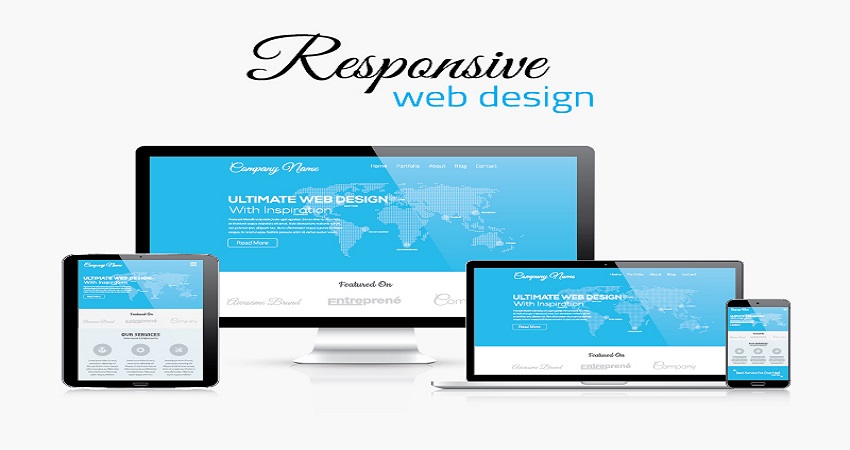
As a business owner, you must already understand the immense necessity of having a fully functional business website to help you with your business development. The web design of your site is the most fundamental aspect which needs to made with a lot of care and dedication in order to ensure that your business is adequately exposed to everyone. However, you must not only create your websites by keeping just the desktop in mind. A lot of recent studies have shown that almost about a quarter of all the mobile phone users exclusively use their smartphones for accessing the World Wide Web. This means in effect that one out of every four people in the world who has a smartphone will use it for browsing the internet. Hence, your business website should be able to function effectively on these devices also. If this does not happen, then you shall risk losing out plenty of mobile phone users. Thus, it is crucial that you embrace using responsive web designs.
This article will highlight to you some tips that can help to make you get more responses on your business website:
- Give mobile phones more priority – Prior to starting out with your planning for your designs for either your desktop versions or the laptop screens, you should be thinking about what a viewer’s user experience might be on the mobile devices. A lot of designers, today, have actually embraced the design for the mobile phones first of all. Why? Well the reason for this is that mobile phones have become more convenient and practical for using than desktops. In these days, more and more people like using their cell phones for browsing the internet than previously. Thus you should try to build websites which are primarily mobile friendly and then you should create specific designs with regards to the sizes on the giant screens.
- Understand how Media Query works – Media Query is a useful feature which primarily allows several types of contents to be responding under various different conditions over specific devices. Media Queries like to check the resolution of a device, what its height is, or its width and the specific orientation of the device. This information is then used by it in order to determine which type of designing rules ought to be applied. Media Queries will help to create responsive designs.
- Know what mobile will mean for your users –People will tend to interact with various websites in various manners and ways through their smartphones and this will be different from the way they behave through the desktops. You can use analytics in order to find out why users prefer to visit your website from smartphones. Maybe they like to find quick information through the search bars. But in case you find pattern common among your other users then you must see to it that the search bar in your website is easily viewable and can be accessed seamlessly also.
- Use statistical percentages – The most challenging aspect of making a web design responsive is in the process of implementing grids which are fluid. These fluid grids tend to function well when the media queries are displaying their contents on several different viewpoints. Try to get and choose a specific size of the layout which needs to be set instead of trying to design other breakpoints for the other viewports. Once this has been done, you shall be able to set up the heights and the widths depending upon the proportion of the website and not the pixels. This can help to set your site to get adjusted with several layouts, with you never feeling the requirement to adjust your layouts, because of the percentages.
- Your specific speed requirements – It can take some time for websites with responsive dreams to load. People who use smartphones for browsing the web will want their web pages to get loaded quickly. In general web pages will take a little more time to load if the images which have been used in it are not properly optimized. Too much of different elements will weigh your website down. This can lower your website’s total responsiveness. Hence you must make it a point to scale all your large images down in order.
- Remove all the unnecessary and extra stuff – You need to remove all extra, excessive, unnecessary elements away from your business website. It will help to enhance the user experience and also help to make your web pages load faster and quicker. Sites do not look attractive if they have too much of extra, superficial elements. Hence all those stuff which are not especially crucial to your site must get removed immediately. This will go on to lighten and reduce the junk from your site and give only necessary information.
- See to the readability of your site – You must ensure that your users do not have to squint in order to be able to read your content or that they have to pinch their screens in order to zoom and read. Your text size will have to be optimized so that it can get easily read on small screens. You should keep 12 pt as the optimum font size of your texts.
You should visit Remotedba.com to learn more about web designs and how responsive web design can help your business grow more.
Wrapping things up
Responsive web design will help you by making it a lot easier for your users to be able to see and access your website and all its contents from any device they use. The tips mentioned in this article will help you in making a good responsive web design. If you can increase the mobile responsiveness of your business website, you can get more viewers, and this will help you in getting more and more customers also and boost your business revenues.