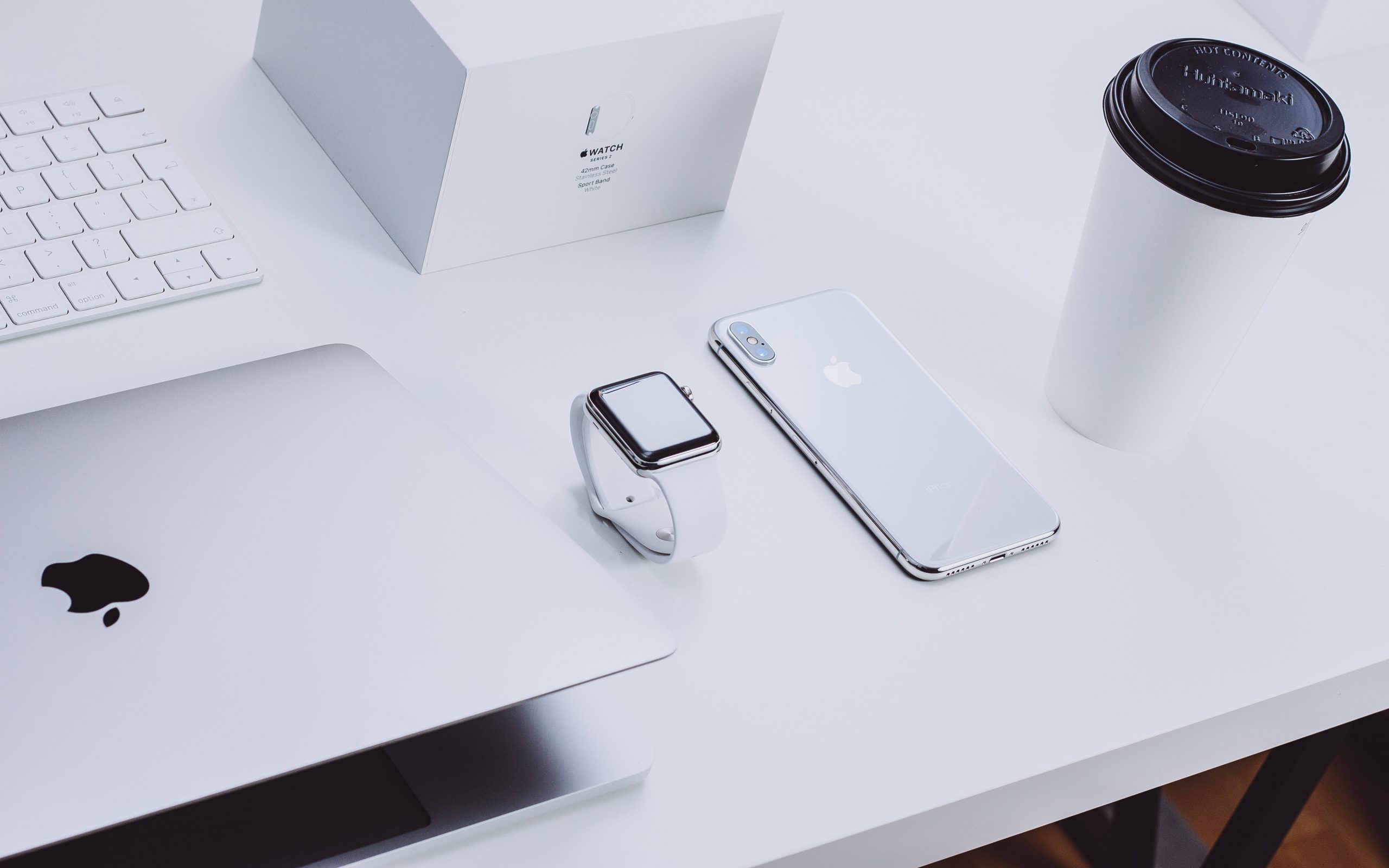
When most people hear about Apple Inc., they usually picture a bitten apple. But did you know that it’s not actually Apple’s first logo?
The company’s first logo was a simple depiction of Isaac Newton sitting under an apple tree, in which he was most widely recognized.
The logo also has its own traditional frame with a phrase from William Wordsworth, a romantic English poet: “Newton… a mind forever voyaging through strange seas of thought.”
But Steve Jobs decided to change the logo due to scalability problems and its old-fashioned design.
From hereon, let’s take a tour of how the Apple logo has changed over time. Let’s also explore some of the famous people who have been associated with Apple, including Steve Jobs and Rob Janoff.
History Behind the Apple logo (1976)
Everybody knows Steve Jobs founded Apple Inc., but who are his co-founders?
In 1974, Jobs met with his high school friend, Steve Wozniak, who was working on a logic board at the time, and Jobs was highly interested in the innovation. Together with Ronald Wayne, the three co-founded Apple Computer Inc.
The logo was created by Wayne depicting where Isaac Newton was said to first establish the law of gravity.
How? An apple fell on his head.
The logo was unclear, old-fashioned, and just wouldn’t make the cut if the company wanted to last long. But, just as Wayne’s control of Apple Inc. was short-lived, so was his logo design.
Steve Jobs knew that it was time to revamp the logo design. Since there was no logo maker at that time, he hired graphic designer Rob Janoff who developed the world-famous bitten apple emblem.
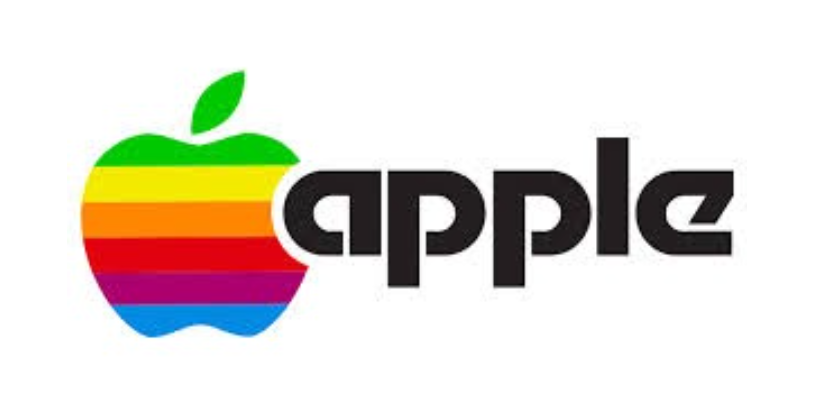
Initially, the logo had a wordmark and a bitten apple icon with a rainbow spectrum, an ode towards the world’s first color display computer they manufactured.
The logo debuted days before the product launch.
And according to Janoff, there was no specific meaning behind the rainbow colors, but Jobs only requested the green at the top where the leaves always were. Meanwhile, the bite/byte indicates that the icon is an apple rather than a tomato or other fruit.
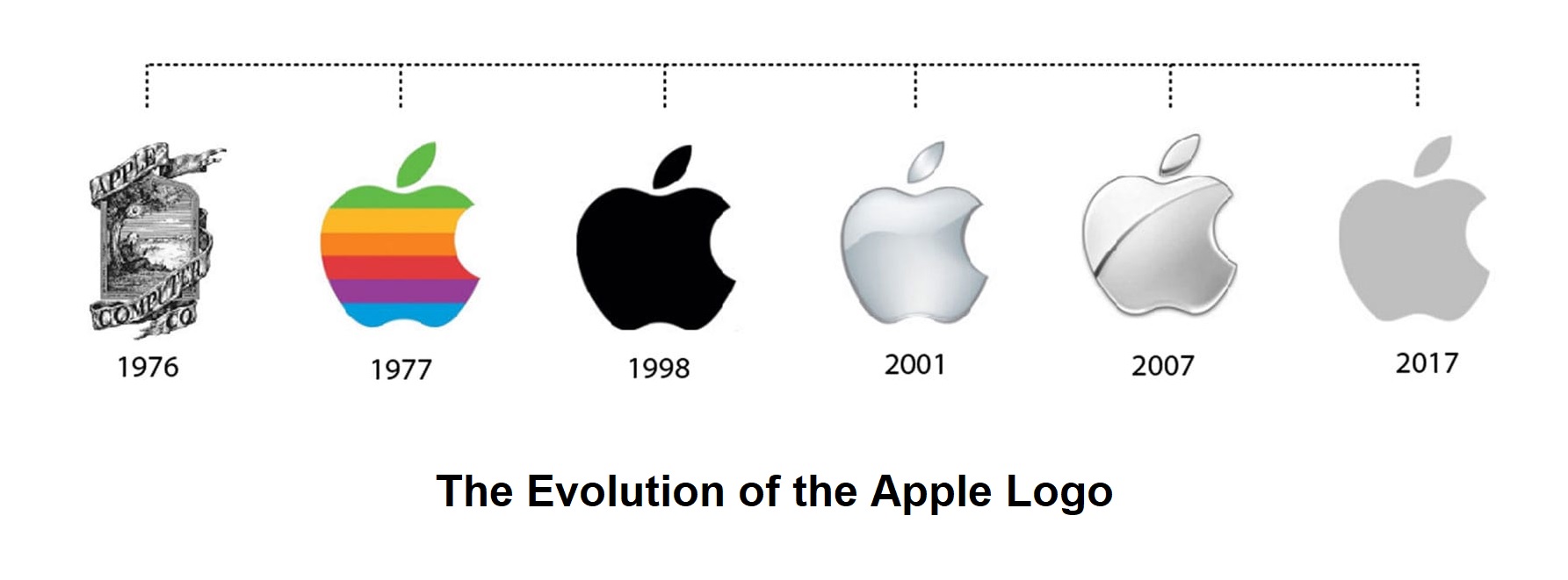
The Evolution of the Apple Logo (1984-present)
As one of the most well-known and iconic logos in the world, Apple’s logo has undergone many changes over the years. Let’s explore how it has evolved, from its first design to the most recent update.
Removal of the WordMark (1984)
In 1984, Apple released its first product, the Macintosh computer. This product became one of history’s most important pieces in modern-day technology (and beyond).
The Landor Associates, a branding consulting agency, took out the company name and merged the logo into what we now know as an “iconic” Apple logo design – but the rainbow colors remained.
The Translucent Apple (1998)
Steve Jobs was fired from Apple in 1985 but returned in 1998 as Interim CEO when the firm was in financial trouble.
His comeback coincided with the company’s redesign, which included the Apple logo. It was a difficult era for rebranding because the Apple logo was already well-known.
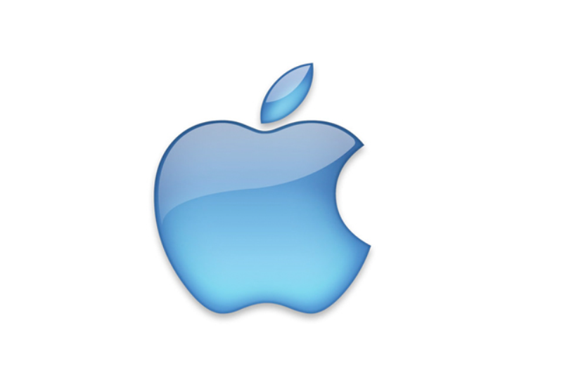
But they continued with the logo revamp and replaced the rainbow spectrum with a blue translucent logo. However, it was only temporary because they realized that a solid hue would better complement the metallic casing of the Apple products.
The Glassy Monochromatic Apple (1998)
In the same year, Apple introduced a sleek and simple glassy, metallic black icon, keeping the apple bite icon. This monochrome color was applied to all Apple products until 2000 when Aqua Apple was discovered.
The Aqua Apple (2000)
The glassier, the better?
I suppose that’s what Apple thought. They replaced the glossy, shiny black icon with an aqua-colored apple, which symbolizes the transition from a low-cost brand to a high-end one.
The Aqua-colored icon with a gradient shade on the sides represents class and innovation they continually strive to provide for their consumers.
The Metallic Chrome Apple (2007)
What about a glassier, more metallic look?
In 2007, the Apple logo decided on its 7th Rebranding in terms of renewability. For some users, adding a ‘more metallic’ aspect gives them a more costly appearance.
This new logo reflects its philosophy and values as it strives to become a more renewable, energy-efficient brand and technology.
Flat Design Minimalist (2015)
Today, Apple has chosen to go for a minimalist logo design that features three colors – white, black, and silver, which is often seen in most of their products.
This change supports the company’s philosophy that simplicity is vital and that users aren’t just driven to their product by flashy designs and colors. But to the quality and distinct features it offers.
The present design retains the bitten apple logo and is widely regarded as a symbol of sophistication and creativity, which has become one of the most recognizable trademarks in the world.
Why was it called “Apple?”
The first and original logo design was inspired by Isaac Newton’s law of universal gravitation. While there’s no evidence that the apple fell from the tree and landed on Newton’s head, the narrative inspired the moniker “Apple.”
Another reason for the company’s name is because Steve Jobs was an apple fanatic. In a 1982 press conference, he revealed his love for apples. When he visited an apple farm, he thought of apples as fun, spirited, and not intimidating.
Likewise, he hoped that prospects and consumers could see the company as fun, dynamic, and not intimidating.
Some people might speculate that it may have something to do with his favorite musician, the Beatles. The Apple Corps, a multimedia corporation, was responsible for forming the Beatles, a well-known band. Others speculated that he chose the same name for his techno company because he is a major Beatles fan.
But it isn’t the only rumor floating around about the Apple name.
Phone books are a thing in the ’80s and 90s. And since the individual and business name was sorted alphabetically, Jobs may have thought of naming the corporation Apple so that it would be easily recognized by the masses.
At the same time, Apple was competing with Jobs’ former employer, Atari, which had the same initials as Apple. In a later interview, he revealed that ‘Apple’ was also chosen to appear before Atari.
And finally, it was later revealed in a biography of Steve Wozniak that the Apple founders decided to stick with the name because they couldn’t think of anything else better.
Some other speculation includes:
- The well-known account of Eve biting into the forbidden fruit, which many people mistook for an apple.
- Alan Turning, who later committed suicide by eating a poisoned apple, was its inspiration.
- It comes from Greek mythology, where a huge class of female nature deities can achieve immortality by eating a golden apple.
- It’s because of the famous phrase, “An apple a day keeps the doctors away.”
Regardless of the rationale, Jobs claims that the Apple Inc. moniker has no deep or hidden meaning. And if his co-founders had thought of anything better, they would have given it a different name, perhaps even something more ‘techy.’
Final Thoughts
Apple is one of the most successful companies globally, and its logo has evolved over time to reflect that. From the original bitten apple to the Newton sitting under an apple tree, the logo has undergone significant changes over the years.
Each new logo version has reflected the times and the company’s values. The minimalist flat design of today is a perfect reflection of Apple’s current values, and it will be interesting to see how it evolves in the future.
And while some might say that the current logo is a bit too simplistic, there’s no denying that it’s become one of the most recognized logos in the world.
What do you think of the Apple logo? Do you have a favorite version? Let us know in the comments! And be sure to check out our other posts on all things Apple. Thanks for reading!
