Introduction: The Growing Importance of Responsive Web Design
Did you know that the average person spends over three hours per day on their mobile device? This is a testament to the fact that dynamic devices dominate the digital landscape. And as users seamlessly transition between devices, websites must adapt organically.
Responsive design isn’t just a design philosophy; it’s a user-centric revolution. It’s the key to ensuring a harmonious and captivating user experience across desktops, tablets, and smartphones. Join us as we delve into the intricate world of HTML editor JavaScript, the linchpin of responsive design. Brace yourself for a journey where innovation meets user satisfaction. Witness the ever-changing landscape of the web transform into an immersive, cross-device tapestry.
Understanding HTML Editor JavaScript
HTML editors are indispensable tools in every developer’s toolkit that make stunning and functional web design a possibility. And now that responsiveness is key, the seamless integration of JavaScript into HTML editors has become a game-changer. JavaScript not only adds dynamic functionalities but also plays a pivotal role in optimizing the user experience. In this context, the focus is on the crucial role of responsive preview modes in HTML editors with JavaScript.
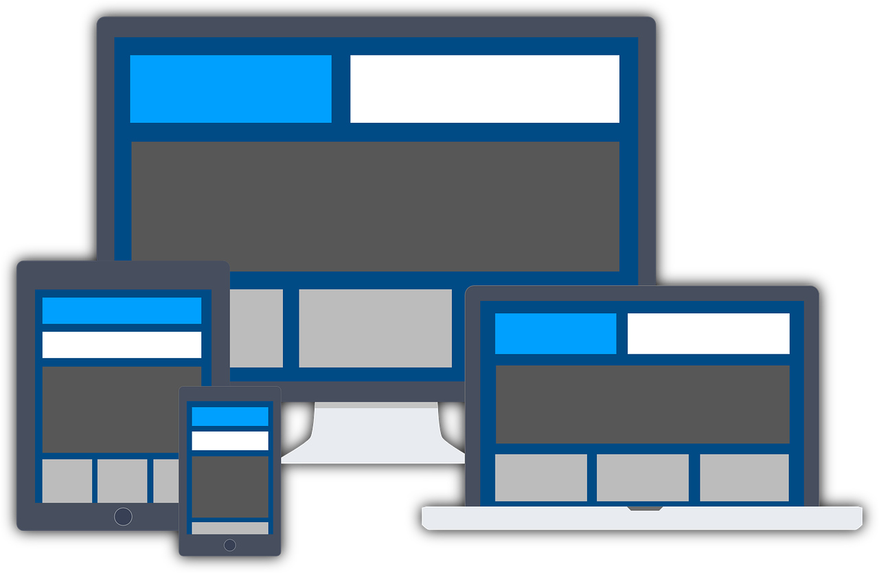
The Necessity of Responsive Preview Modes
Web development is no longer confined to desktop environments. Imagine crafting a website that looks impeccable on a desktop but appears chaotic on a mobile device. The solution? Responsive preview modes. These handy features allow developers to visualize how their web pages will appear on different devices, such as smartphones and tablets. This real-time feedback in HTML editor JavaScript is invaluable during the development process. That’s because it helps developers identify and address potential layout issues preemptively.
Responsive preview modes serve as the bridge between development and user experience. They provide developers with a glimpse into how their websites will appear on different devices, allowing for adjustments and refinements on the fly. Without these adaptive interfaces, developers would be left in the dark, relying on guesswork and endless trial and error.
Froala’s Approach to Responsive Previews and Other Examples
Froala, a prominent player in the HTML editor landscape, recognizes the significance of responsive preview modes in the development workflow. Their HTML editor leverages JavaScript to offer a live content preview feature. Thus, it allows developers to instantly see how their designs will adapt to different screen sizes by switching between device views.
Other HTML editors, recognizing the demand for responsive design, have also incorporated similar functionalities using JavaScript. CKEditor, TinyMCE, and Quill are among the many that offer responsive preview modes, each with its unique approach to enhancing the user experience.
These examples highlight the industry-wide acknowledgment of the importance of real-time preview modes in HTML editors. We’re sure you can appreciate the role of JavaScript in making these features robust and user-friendly.
Benefits of Responsive Preview in HTML Editor JavaScript
Responsive preview modes in HTML editors with JavaScript offer several advantages for developers.
1. Real-Time Visualization
Responsive preview modes offer developers an instant, real-time visualization of their websites on different devices. This instant visual assessment empowers developers to make informed decisions and adjustments as the need arises.
2. Streamlined Workflow
The days of making changes, saving, and refreshing to see the impact are long gone. Even external testing tools and constant device switching have become obsolete. Developers can now stay within the HTML editor environment and eliminate unnecessary steps.
3. Improved Collaboration
Teams working on web development projects can benefit immensely from responsive preview modes. Team members can quickly share and review designs across different devices. This fosters better communication and makes the design choices and adjustments made clear.
4. Enhanced User Experience
Ultimately, responsive preview modes in HTML editors contribute to an enhanced user experience. Developers can fine-tune their designs confidently, knowing how the web page will look on the end-users’ devices. This guarantees a seamless experience for users regardless of the device they’re using.
Implementing Responsive Preview: Tips and Best Practices
Looking to implement responsive preview modes in HTML editors with JavaScript? Here’s how to do it right:
- Ensure that the responsive preview functionality works seamlessly across various web browsers.
- Consider incorporating device simulation features that emulate the behavior of specific devices accurately.
- Provide customization options for developers to define their own device profiles or screen resolutions.
- Optimize the performance of the responsive preview mode to ensure quick and responsive interactions.
- Minimize latency and delays to provide a smooth user experience.
- Test your responsive preview on a variety of devices and screen sizes to ensure universal compatibility.
- Leverage browser developer tools to quickly test scenarios without the need for physical devices.
- Ensure touch interactions are taken into account, especially when previewing on mobile devices.
- Optimize images and media to ensure a seamless and fast-loading experience across the board.
- Stay informed about updates in HTML editors and JavaScript libraries to ensure you are utilizing the latest responsive preview features and improvements.
Conclusion: The Future of Content Creation with Responsive Previews
The integration of responsive preview modes in HTML editors with JavaScript is a pivotal aspect of modern web development. Integrating real-time visualization into the development workflow is non-negotiable.
As we stride into the future of dynamic content creation, we see this trio emerge as a shining light. The synergy between HTML editor JavaScript and responsive previews promises a landscape where innovation flourishes, collaboration thrives, and user satisfaction takes center stage. Empower yourself to craft websites that transcend devices, ensuring a consistent and delightful user experience. Embrace the possibilities and usher in a new era of dynamic and responsive digital experiences.
FAQs
What are responsive preview modes in HTML editor JavaScript?
Responsive preview modes allow users to see how their content will appear on different screen sizes and devices directly within the HTML editor. Thus, they ensure the design adapts effectively to all viewing contexts.
How do responsive preview modes enhance user experience?
Responsive preview modes provide real-time feedback on how changes affect the visual layout across various devices. Thus, they help to create a more intuitive and user-friendly content creation process.
Can I integrate responsive previews with any HTML editor JavaScript?
Many modern HTML editors like Froala offer built-in responsive preview modes. However, the integration capability might vary. Therefore, it’s best to consult the specific editor’s documentation or support for guidance.