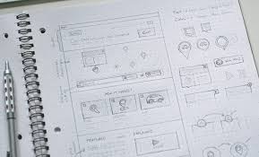
Everyone makes mistakes and no shame in that, as long as you willing to take the necessary step to fix it. However, some of them can be avoided by learning a few key UI principles and common mistakes often made by designers. Take a look at the five most common mistakes made by UI designers.
Mistake 1: Overstuffing
Follow the concept of less is more and putting way too much on the screen is a sensory overload for anyone. Designers continuously face the issue of having to fit a lot within such a tiny space. Since more and more users are regularly using mobile phones to search for information, emphasize on few vital elements of your website rather than all.
You want to be selective during the process, as attracting the ‘right’ kind of attention is the goal. If there is too much on the screen, users will get lost or frustrated.
Mistake 2: Not Having an Underlying Vision/Concept
Like an architecture first draws the layout of a new home before it is built, you must do the same for your website. Not having an underlying vision or concept to fall back on and follow through with is going to make things not only harder.
Tip: Use Google Analytics to monitor the data and see if what pages are people more interested in and what they are not interested in. Do constant evaluation.
Mistake 3: Lacking Consistency
The layout should be consistent, use the same colors and patterns and elements to bring out the look. Style guides can help with this. You don’t want to confuse the user for what they need to do.
Instagram in December made this mistake with an update that the scrolling of the feed changed from vertical scrolling to horizontal and people were outraged. That doesn’t mean don’t be willing to be creative but don’t make things harder for the user.
Mistake 4: Abusing the Fonts
Fonts can be beautiful, and they can make or break the design that is put to the test. They should be easy to read and flow with the design and layout. You can go with a system font that is simple and versatile, or a custom font.
However, if you’re choosing something a bit more off the beaten path, then think of these two things:
- Less is definitely more. You don’t want to overdo the look of the app and ruin user experience by having something over-the-top. Having too many types of font and color choice can ruin the app. Custom fonts should improve the app, especially if you’re paying a bit for them.
- Fonts are software, remember this. They are always licensed. You should read the licensure and terms of use for the font before proceeding with it. Using them badly can cost thousands of dollars.
Good read: 20 Fonts you should absolutely avoid
Mistake 5: Designing without knowing the user’s goal
You have to design something, but if you don’t know the goal of the user, then how will you design it well? You need to know what the original approach was of the edits you’re making. How should the app work for the user? What is their main focus or goal?
Even though this is a simple thing that many people might already think about, it is also something simple to overlook. It is a fundamental of creating or designing anything that is oftentimes not considered.
Reducing the number of mistakes made in the UI/UX designs that you put together can help you create something great. Mistakes happen, and we let them. Learn from any you have made and learn from the one’s others have made. This will make you a much better designer overall and help you grow in the years to come.
