Getting people to stick around your brand is not an easy feat. We mainly consider positive referrals and high-quality products to be the main drivers of brand success. However, the logo of a company plays a pivotal role too.
If your logo seems unprofessional, your prospects will raise questions on your credibility. In those moments of snap judgment, people will prefer an opponent and never look back. According to Micro Creatives, 67% of small businesses are willing to pay $500 for a logo, while 18% would pay around $1000. With so many options to choose from in the market, it’s important you do your research. Nowadays you can even use logo makers to come up with your perfect logo, but be sure you read on the pros and cons of each so you choose the best logo maker.
Needless to say that the logo design sets the bar for success for small and big scale entities alike. So, cultivate a strong logo to stand out among consumers. Make sure they remember your brand and create positive associations with you. Squeezing all such info in a small image takes careful planning. Other businesses are also using custom logos to further enhance there visibility in the market.
Here is a list of 5 basic design principles of a kick-ass logo design:
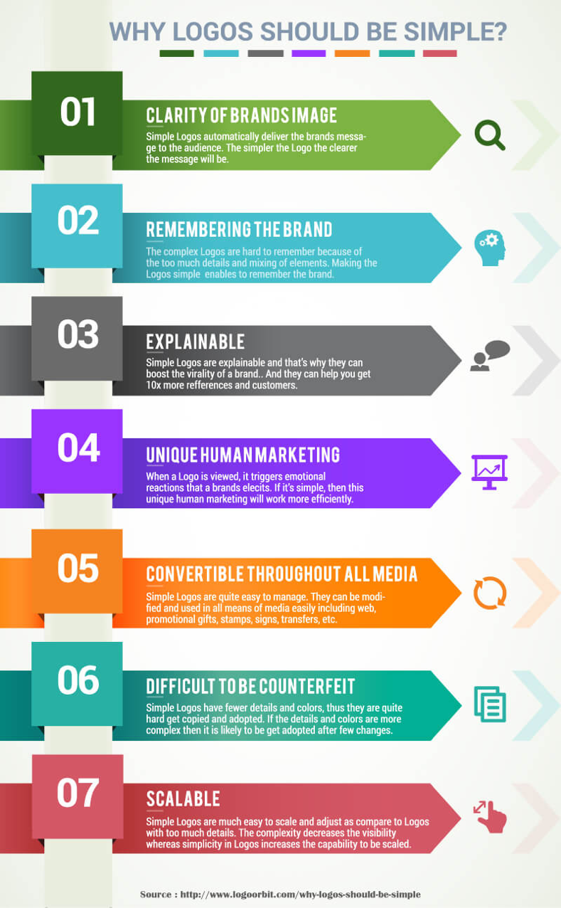
- Simplicity
The beauty of simplicity is that it asks for less cognitive processing. Over the years, the human attention span has shrunk to being less than that of a goldfish. There is little chance for people to remember complex logos and taglines.
Source
Bear in mind that a logo has to work across different platforms, in different sizes and formats. Those fine details might lose out, sometimes. Therefore, a simple and streamlined logo provides assurance, strength and stays in the memory.
Follow the K.I.S.S principle of design. Translated as “Keep it simple, stupid,” it is an integral design principle. A refined design with little info to consume will catch the attention of the onlookers. For example, you can spot a runner’s shoe brand from a mile away if it is a simple, graphic swoosh.
- Memorability
The underlying reality of a simple design is that it is more memorable. It should be such that one glance makes a viewer recall the brand products/services. We have tons of corporate logos swimming around us, but only some manage to cut the clutter and stay imprinted in our brains.
For example, what does the image of a half-eaten apple remind you of? Steve Jobs and his incredible tech empire, “Apple,” right?
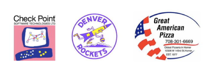
In contrast, a logo jammed with information and colours has less chance to stay imprinted in the viewer’s mind. Look at the following logos. These companies have tried to stuff a lot on their logo, causing it to lose its purpose and memorability.
Another aspect of a memorable logo is that it stands tough against the tests of time. Coca-Cola, for instance, has not updated its logo in 50 years. It is still fresh and competitive as it was in the earlier years.
For creating a memorable logo, look for inspirational ideas of creative logo designing to turn things in your favour as it gives you a perspective on prevalent logo trends.
- Originality
“Insist on yourself, don’t imitate.”
Quoting Ralph Waldo Emerson seems plausible here. Your logo should stand out yet follow the crowd. It is okay to scan the market for inspiration. Just make sure that your logo does not look too much like others out there.
Ask the professionals on board to come up with a distinct logo design. It must fall in line with your brand purpose and shouldn’t let people confuse you with any other brand in the market.
You don’t need to spend a fortune on the logo design. A proficient team of specialists like that of logo design valley can help you develop a unique logo within an affordable price range. According to Finances Online, Twitter’s old logo design cost a mere $15.
- Aesthetic Appeal
Another factor to consider during logo design is that it should be visually appealing. It should grab a consumer’s attention for ten seconds so they can retain it and form an opinion about it. Some factors that account for enhancing the aesthetic appeal are:
Colours – Choice of hues has the power to compel purchase decisions. It triggers emotions and gives meaning. Some specific colours befit an industry and the target market. For example, financial institutions mainly use blue because it conveys reliability. Similarly, fast food brands usually go for red as it triggers appetite.
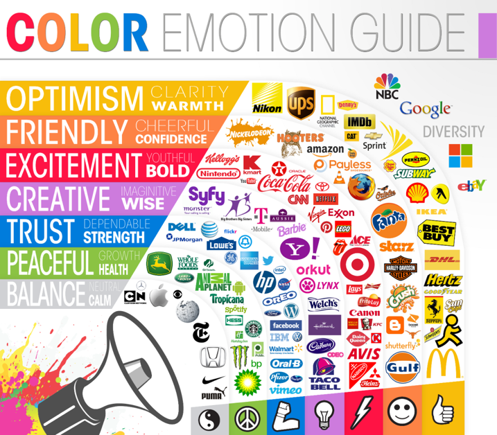
So, pick the colours based on the feelings you want to trigger. You should consider human psychology, trends, culture, and context.
Typography – The selection of typefaces and their arrangement is also imperative when creating a brand logo. People tend to create a link between how a word looks with what a word means to determine how they feel. Every brand inevitably wants its typography to strike interest, encourage optimism, and promote trust.
Make sure the fonts chosen are understandable and appealing at the same time. The company name should be legible and clear. Consider how it will look on different mediums where you plan to use it—for instance, business cards, billboards, letterheads, etc.
- Industry Relevance
How you design the logo should align with the purpose of the industry. Let’s say you are designing a logo for a toy store. It makes sense to use a colourful font and childish theme. But when it comes to a legal agency, these fonts and graphics may not work.
However, keep in mind that your logo doesn’t need to show what you are selling. Car logos don’t need cars, and a shoe company logo doesn’t necessarily need shoes on the design. Paul Rand says that it is only by association with a product, a service, or a corporation that a logo has any real meaning. In fact, it takes its meaning and usefulness from the quality of that which it symbolizes.
Check out the top 50 brands of the world. 94% of these do not describe what the company does. It is indeed a tricky line to walk. But a strategic logo design can help you cut the clutter and come up with a simple yet futuristic design.
Parting Thoughts
Crucial to an effective logo design is the creativity in capturing the brand’s message and values. Of course, the real essence comes from the quality of products or services. We hope you will carve a path to impress prospects with your logo and nail the impression with flawless products/services.
Don’t forget to let us know how our blog helped you out!