Is there a future in web design? What are the 10 web design trends in 2022? The world of website design is ever-evolving, seeing as there are trends that tend to come and go with every year that passes, and keeping up with all of these would be able to make your website more effective than before. You could know more about trending web design by visiting Big Easy SEO.
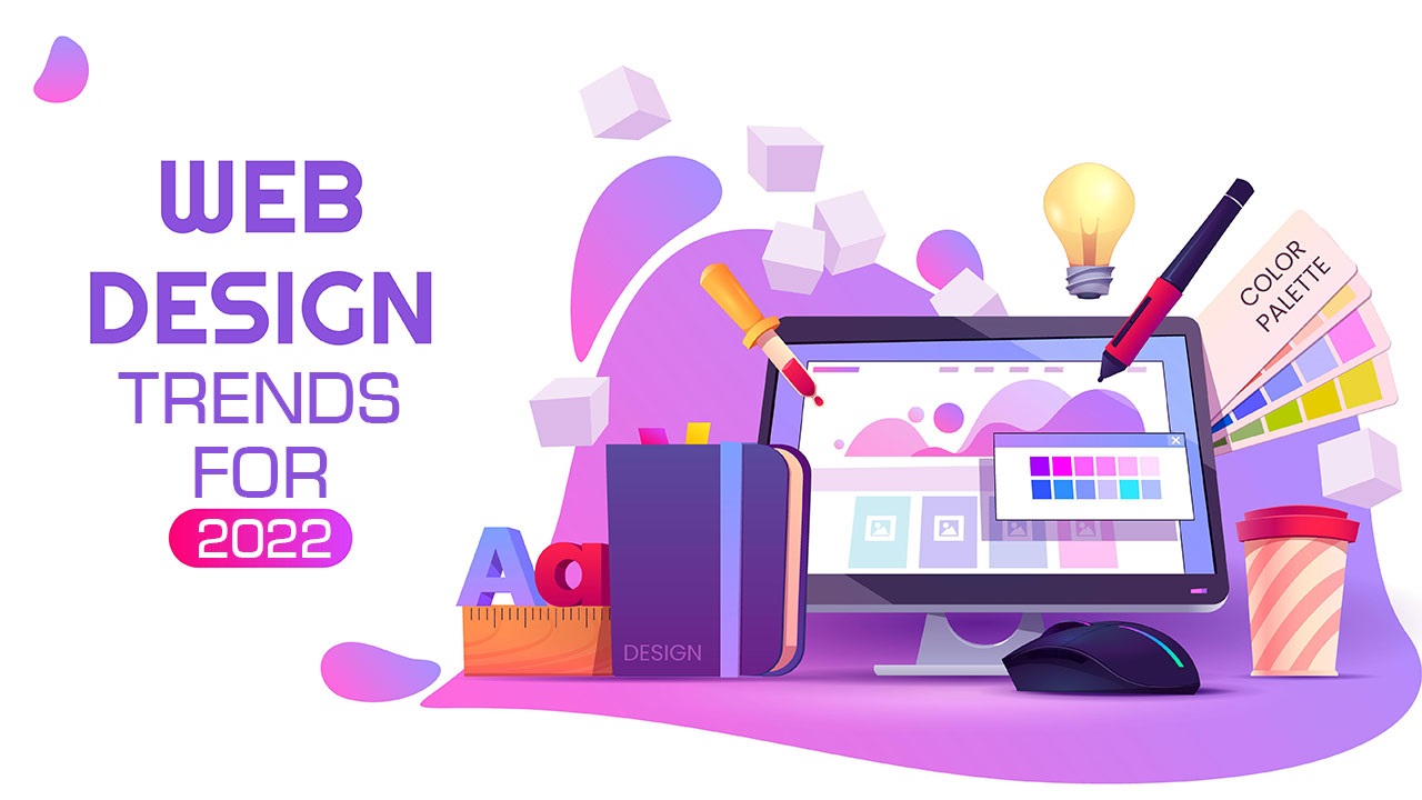
Web Design Trends in 2022
1. Fewer images
There are a lot more designers who prefer going the minimalistic route, choosing to create a hero section and landing pages. They choose to take off a big distraction by not putting as much imagery so people who visit their website would be able to focus on the content and the style more instead of relying on pictures and illustrations.
2. Fonts
Making fonts a bit more interactive and applying a bit of a hover-state change button would help the design a bit more creative and elaborate without having to use all of these fancy codes and not having to program and write these by hand. You have to keep in mind that some people could easily get distracted, especially with these moving fonts, so make sure that it is still legible and not over the top.
3. Collages
In order to give a tactile feeling, give a more white space design on your website, and put in images without having to focus on the whole design around the image that you have on your website, you could put the images in a collage style illustration.
When you are putting in your collage, you could put in some shapes, patterns, and even add more colors in the college itself, filters, tints, and monochrome effects are also there so that they could blend with the design overall and fit with the aesthetics of your website.
4. Linework
The linework is a mixture of both modern and throwback that would be able to give the visitors the visual distinction between sections, headers, photographs, and the product galleries. Aside from creating those distinctions, they could also elevate your design and give you one of the biggest impacts on your final design.
5. Glass Morphism
A combination of transparency, blurriness, and movement gives off an illusion of a glass-like design, which is what glass morphism is. You would usually find this effect around logos, illustrations, and full sections.
When you are doing glass morphism, you have to find the perfect balance between diffusion, shadow, and reflection so that you could create the optical illusion perfectly and not overdo it. It would be able to give a 3D feeling to the whole site without making it feel all over the place.
6. Split-screen
The split-screen design has been surfacing up recently, giving the website a more design contract, interest visually, and giving the distinction of natural separation of content, giving you a perfect excuse to try experimenting on colors.
7. Inclusive copy
With a shift to universal awareness in today’s day and age, you have to shift towards inclusive content and language, making your websites a more welcoming and accessible place for people all around the globe.
8. Dynamic content
The content that you put out is just as important as your website, and having content that is dynamic would be able to give the designers more chance of freedom, add more complexity and build the site bigger without having to put in more work and adjustments.
9. Responsive designs
Having a responsive design has been a standard practice, especially in a time where putting it on your website would be much easier now. You don’t have to go overboard with the moving parts of your website because there are a handful of people who may get motion sickness with all of the moving, and it could sometimes be caused by the animation, parallax effects, and plane-shifted scrolling, so you have to avoid putting too much of that element in your website.
When you are putting in motion your website, it could be used responsibly and more subtle. You could use the preferred reduced-motion CSS media query so that you could hide the animated SVGs and show a reduced motion version of the design aspect that you put in your website to help with all of the possible rigorous motion.
10. One-pagers
The more complex the whole website, the less effective it may be, so a one-paged website has been a trend especially if the subject matter of what is in your website is much more narrow and could easily be navigated by scrolling through everything. A great example of when to use a one-paged website is when you are posting a portfolio and when you are showing them a single idea.
One-pagers usually give them a feeling like they are holding a poster or they are reading a flier since everything you need to know and all of the information that they may need would all be presented in that one-page website, giving them little to no distraction like having to navigate their way through more information and having to look at other pages.
The trends in the visuals in web design could be categorized by era and web designers have been finding creativity far beyond images, typography, grids, and lines, but in things like navigation, animation, colors, and textures as well. Keep up with the fast-paced trends by partnering up with a web design company to help you with the overwhelming pace that is the web design world.