Introduction
In the last decade the progress of technology within corporate and educational environments has pushed the adoption of several tools and practices. The popularization of productivity tools as Microsoft Office, Apple Office and more recently Google Docs has generated that certain practices became mainstream. Presentations have always been a powerful mean of communication. The widespread of technology helped speakers to empower their speech with visual assets as PowerPoint presentations, videos and sounds. The term “PowerPoint Presentation” is now a de facto adopted term, related to the visual collateral used by speakers during the delivery of a presentation. Also known as Presentation Deck, this assets is created as a set of slides containing text, diagrams and images.
Experience has shown that the popularity of presentation decks also generated an abuse. Bad practices applied to the creation of presentations started to generate bad publicity due to horrible decks; even a term has been created, known as “Death by PowerPoint”. Studies show that the problem of bad presentation decks resides in the lack of graphic design knowledge of users. Non experienced users create presentation decks with just text in their slides, with the purpose of creating presentations notes, instead of a visual asset that will enrich the speech.
In the last five years, with the popularity of social networks and the incredible huge numbers of presentations being delivered every day, a new breed of tools were born, used to share presentation decks online. The most populars nowadays are SlideShare, SlideOnline and Docs.com. This tool are sharing platform for presentations, where users upload their presentations decks. This collaboration tools generated a community of professional presenters that started to see value on sharing amazing decks, trying to spread best designs practices to the online community.
In this article, we would like to provide five (5) tips that will boost your SlideShare performance (shares, clipping, etc.). Of course, take into account that the real value is in the content you present and not in the deck itself; these tips are recommendations on how to display your content in order to attract the audience attention. This tips were suggested by our friends of SlideModel, which provides Free PowerPoint Templates anyone can use in their SlideShare presentations.
First Tip – Choose Your Fonts Wisely
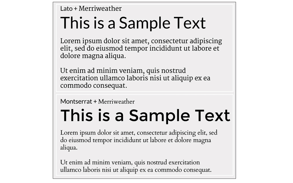
One of the most ignored design practices in presentation decks is the fact that fonts typeface impact directly in the engagement of your copy. The typefaces sends a message itself, and how they are used across the deck can change how the audience recalls the message. When you share a presentation deck through SlideShare, you need to take into account that the visual design speaks as much as the content ; if fonts visual quality is low or design is not easily readable users will not engage. Follow this tips for choosing fonts:
- Use the same font set throughout your entire slide presentation. Being consistent across the deck with the same fonts combination is essential to let the text flow. Changing fonts from slide to slide makes our brain switch context. Same fonts, same patterns, higher retention.
- The font set should not use more than two complementary fonts. Depending on your deck design, you may keep your fonts constrained to structure; for example one typeface for titles, other for text. Do not abuse of font change, even though the structure you decide to use has several levels, repeat typeface and only use size to generate distinctions. When combining typefaces make sure they are complementary; this means that the aesthetics of both look good together and that they do not generate distraction when read together. Regular users have some trouble to understand fonts complements, that is why the use of PowerPoint Templates can ease the job for this. For those more curious they can review several design blogs with suggestions, ie: FontPair and Awwwards.
- Understand when to use Serif and Sans Serif. Serif fonts are designed to be used in texts, inherited from the physical publishing industry. Serif fonts are said to be easier to read at small point sizes; they require high resolution displays. Sans serif fonts are simpler in terms of design, so they are popular among the web and presentations because they do not lose visual quality though projectors or screens. For SlideShare decks, the choice is simple, unless you write a paragraph, use Sans Serif fonts.
- The fonts effects are used to separate concepts or message. Apply Bold and Italic when the text you are writing needs to be highlighted and separated from the rest. Sometime is wise to combine techniques (ie: colors and font effect).
- Fonts size need to be homogeneous across the deck. As described before, the font should follow the same pattern across the deck in order to avoid the audience focusing in the font itself. Suggestions for font size are simple, Never bellow 18pt, and if possible, use 30pt across this slide. This principle helps SlideShare decks to have less text and bigger messages, forcing the user to be concise and communicate through other visual tools.
The following image is an example of fonts combinations.
Second Tip – Choose Your Colors With Taste
The art of combining colors and building palettes is a design practice with hundreds of years of study. It is applied in paintings, architecture, movies, photography, interior design, fashion, etc. However, this practice is sometimes forgotten in presentation decks. The use of colors in SlideShare decks is essential for modern aesthetics, message highlighting and of course, visual engagement through appealing design. The more colors you use, the harder it becomes to establish a unified design. Follow this tips before choosing your deck’s colors:
- Pick a coherent color palette. Deciding which colors look good together requires experience and some basic tools. For deciding colors, the most antique tool is the color wheel. Choose a palette related to current trends; in the time this article is being written, the pastel palette is very popular among flat design.
- Pick Colors with contrast design. Contrast within colors is needed to compose the design and the relationship between elements. In the design industry there is a well spread rule from the fashion industry that has become very popular among web designers, the 60-30-10 rule. This is not a real restriction, but it has proven record of success. The rule of thumb is a guidance for creating chromatic harmony in a canvas.
- Select a primary color to cover 60% of the canvas, and make this color the unifying theme.
- The secondary color will cover 30% of the canvas. It should contrast with the primary color, to create a striking effect.
- The 10% remaining is left for highlighting important sections of the design, or as a separator. It is known as the accent color. This color should be complementary from the primary or secondary color, depending over which background is placed.
- Pick Colors within the same tint and shade. When the design requires more than 3 colors, the suggestion is to use tints and shades derived from the primary color. The result will unify the design.
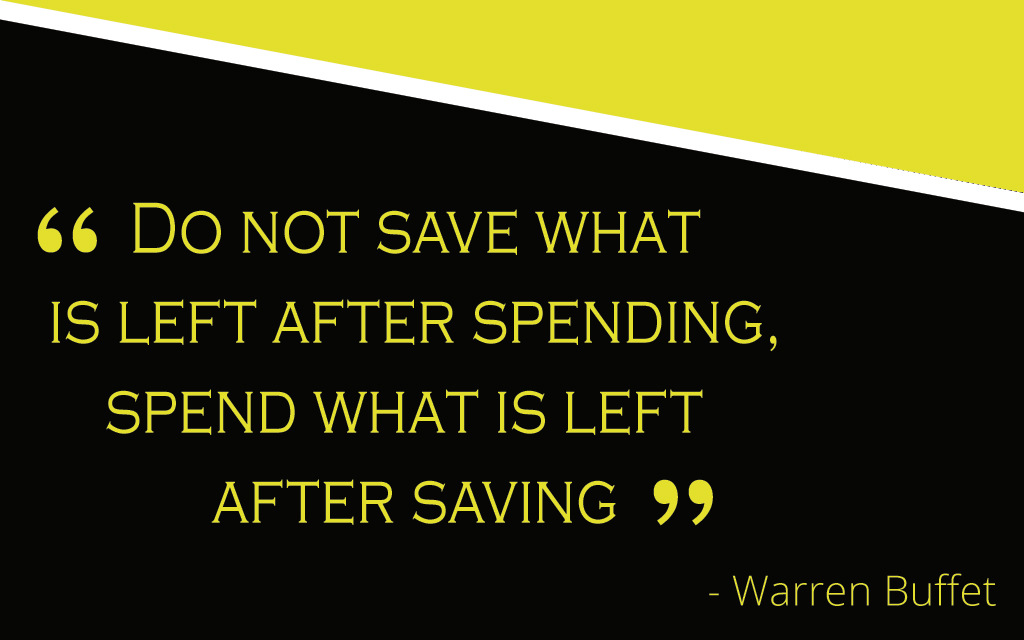
The next image exemplifies the 60-30-10 rule.

Third Tip – Define a “Simple to Follow” Structure
When creating a presentation deck for SlideShare, users will not be following a speech, so it is important to design the slides with a coherent and cohesive structure; this approach will allow the reader to connect messages and to follow a line of reasoning.
- The structure may vary depending the content, but the traditional handout deck structure will be enough.
- Splash Slide
- Introduction
- Agenda
- Section Slide
- Title Slide
- Banner Slide
- Quote Slide
- Two Paragraphs
- Three Paragraphs
- Diagram Slide
- Conclusion
- Call To Action Slide
- For each structure element, create a slide design, and be coherent with it within the presentation deck. The use of prebuilt Presentation Templates is ideal for this purpose ; in case you want your own design, make sure that each structure element is contemplated.
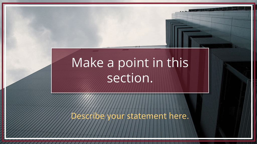
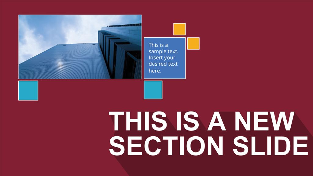
The following slides are examples of structure slides.
Fourth Tip – Create Your Content Visually
The content is the value within the deck, and what is worth to share. It is important to avoid relying too much on text paragraphs. SlideShare is a visual tool, users are used to read between lines and rely on the images and diagrams. The deck cannot be a SlideDoc or ebook. Follow this tips to fill your content.
- Use all the space of the canvas. Do not leave empty spaces in the canvas. Complement the slide with visual decorations as images, diagrams or icons. Different techniques of structuring canvas exist, based on the arts and publishing disciplines. A famous technique that applies really well for slides is the Golden Ratio.
- Use high quality images as metaphors. If your message can be mapped quickly to a metaphor, use a high quality image to represent it. SlideShare readers are used to cool photos.
- Break down your message within several slides. Do not push all your content in one slide, readers can navigate quickly through slides in SlideShare.
- Make your content linear (Next , Next, Next). Navigation in SlideShare is linear, the deck should flow in a forward fashion. Avoid links to other slides. In a SlideShare deck is preferable to repeat something instead of making the user navigate back.
- When describing processes, do not use text, use diagrams and repeat the diagrams through several slides, highlighting the step being discussed.

Fifth Tip – Intro and Wrap Up For Your Message
SlideShare presentations require and introduction and a conclusion. This structure allows the user to understand the content before navigation and reinforces the main messages when arriving to the end.
- Create one or two introductory slides. If the user will navigate through your slides, it must need to be attracted to the topic. Invest time designing this slides as will be the bait for the user flow.
- Create a Conclusion set of slides. Slideshare presentations have at least 10 slides; wrap up your message with a conclusive slides that points the main topics described and their message. When a SlideShare user closes the gap at the end of the presentation is more prone to sharing or liking the presentation.
- Add a Call To Action before the end. Call to actions can be interactive (ask the reader to click) or can be abstract (as the reader to think); every SlideShare presentation should have a call to action in order to help retention of the message through action.

Conclusion
Creating a SlideShare Deck that really impress and audience, requires the use of professional design techniques for the deck to stand out from the rest. Users can apply our fifth tips in order to increase the chances of success and engage readers.